Help your students brush up on their graphing skills with this quick review.
Types of Graphs
Graphs and charts communicate information visually. They can show patterns, help scientists identify correlations, and get the point of the experiment across quickly.
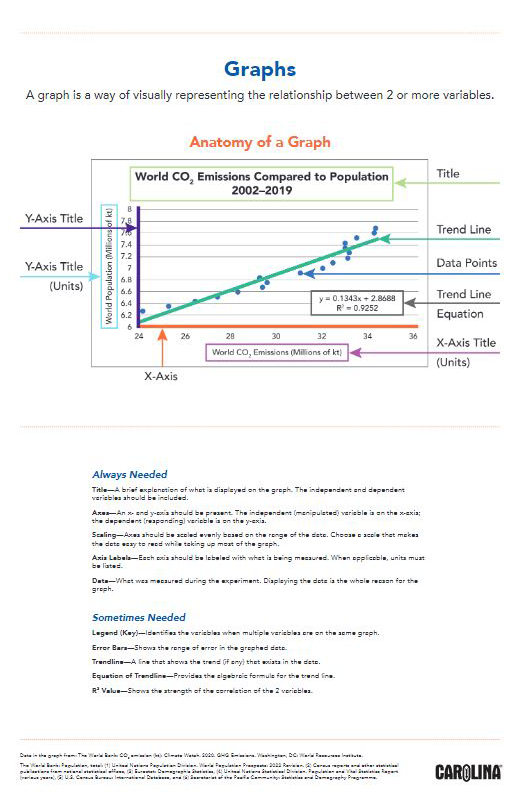
Typically, the independent variable is plotted on the x-axis
The dependent variable is plotted on the y-axis.
The mnemonic DRY MIX, for “dependent, responding, y-axis” and “manipulated, independent, x-axis,” can help students remember this point.
Let’s look at the different types of graphs and which types of data are best represented by each.
Different types of data require different types of graphs. Read on to learn about several types.
Line graph
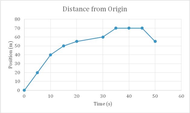
Line graphs show continuous data over periods of time. Before setting up a line graph, determine the dependent and independent variables. The independent variable may be a scalar (numeric) or ordinal (order) quantity. The independent variable always goes on the x-axis. If an experiment requires taking data points every 5 seconds for a minute, or every day for a month, it is appropriate to use a line graph.
Line graphs are similar to x-y scatter plots, except that the individual data points are connected. These graphs may be useful in circumstances when the change from point to point is of interest (as in a titration curve or absorbance spectrum). See the example below of a line graph showing the distance an object traveled from its starting point over time.
A graph is a way of visually representing the relationship between 2 or more variables
Line graph
X-Y (scatter) plot
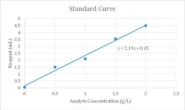
A scatter plot is often used to show relationships between independent and dependent variables. Instead of connected data points with a line, a best-fit line can be used to find a trend in data. Scatter plots are frequently used for creating a standard curve in chemistry, as is shown in the graph below. An equation for the trend line can be determined.
X-Y scatter plot
Area graph
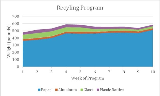
Similar to a line graph, an area graph is used to track changes over time for one or more groups. An area chart works well for data that both changes over time and indicates where the sum and the parts are important.
Area graph
Pie chart
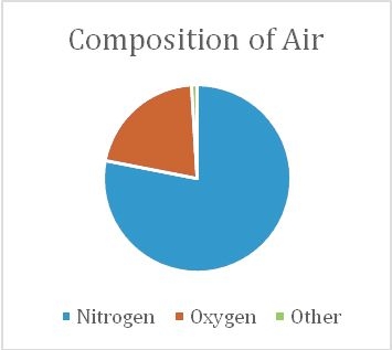
Use pie charts to compare parts of a whole. They depict a single point in time rather than changes over time. A pie chart can display percent composition, such as the composition of air. The area of each sector is proportional to a percentage.